
21 Balloon Colour Combinations That Always Work (And Instantly Upgrade Your Event)
Let’s be honest — balloon colours can either make your event look amazing… or slightly off.
It’s not about having more balloons. It’s about choosing the right colours that work together.
In this guide, we’re sharing 21 balloon colour combinations that always work, plus simple styling tips so your setup looks clean, intentional, and actually worth taking photos of.
Why Balloon Colours Matter More Than You Think
Before we jump into the combinations, here’s something most people overlook:
Balloon colours don’t just “decorate” — they set the entire mood of your event.
- The wrong mix can look messy or cheap
- The right mix instantly looks premium and well-planned
- Guests notice it (even if they don’t say it)
- Photos turn out completely different
That’s why getting this part right makes everything else easier.
21 Balloon Colour Combinations That Always Work
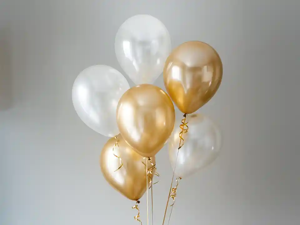
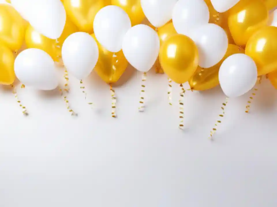
1. White & Gold – Effortlessly Elegant
This is the go-to when you want something clean, polished, and safe.
It works for almost everything — from corporate events to celebrations that need a more refined look.
Styling tip: Mix matte white with metallic gold and add clear balloons with gold flakes for texture.
2. Pastel Pink, Baby Blue & White – Soft and Inviting
This combination feels light, warm, and welcoming.
It’s especially popular because it’s easy on the eyes and looks great in photos.
Styling tip: Stick to matte finishes to keep it looking premium, not shiny.
3. Black & Gold – Bold and Premium
If you want your setup to feel strong and high-end, this combination does the job instantly.
Styling tip: Add small touches of white or transparent balloons so it doesn’t feel too heavy.
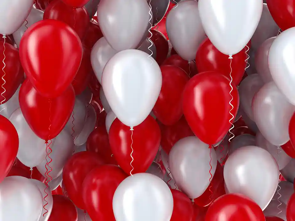
4. Red & White – Clean and Striking
Simple doesn’t mean boring. This combo stands out because of its contrast.
Styling tip: Use equal proportions to keep it balanced.
5. Blue, Silver & White – Professional and Safe
This is one of the most reliable choices for corporate setups.
It feels structured, clean, and easy to match with branding.
Styling tip: Use chrome silver balloons to elevate the look instantly.
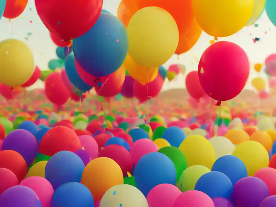
6. Rainbow Colours – High Energy and Fun
If your goal is to create excitement, this is the easiest way.
Styling tip: Choose either all pastel rainbow or all bold rainbow — don’t mix both.
7. Nude, Beige & White – Modern Minimalist
This is one of the biggest trends right now.
It looks clean, warm, and effortlessly stylish without being loud.
Styling tip: Add dried florals or soft textures to complete the look.
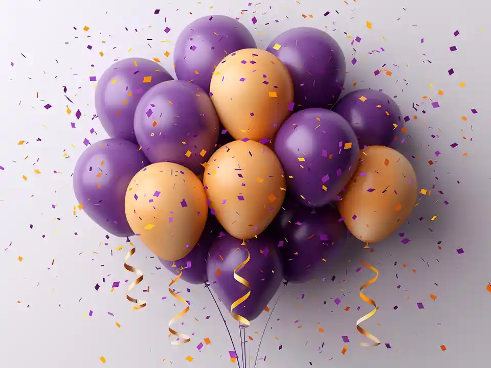
8. Purple & Gold – Rich and Eye-Catching
A strong combination that feels celebratory and premium at the same time.
Styling tip: Use darker purple shades for a more luxurious finish.
9. Green & White – Fresh and Natural
This combination feels calm and refreshing.
Styling tip: Pair with greenery or foliage for a more complete look.
10. Pink & Gold – Sweet with a Touch of Glam
A popular favourite because it balances fun and elegance.
Styling tip: Try blush pink with rose gold for a more modern feel.
11. Orange & Yellow – Bright and Cheerful
This combination brings warmth and energy into the space.
Styling tip: Works best in well-lit or daytime environments.
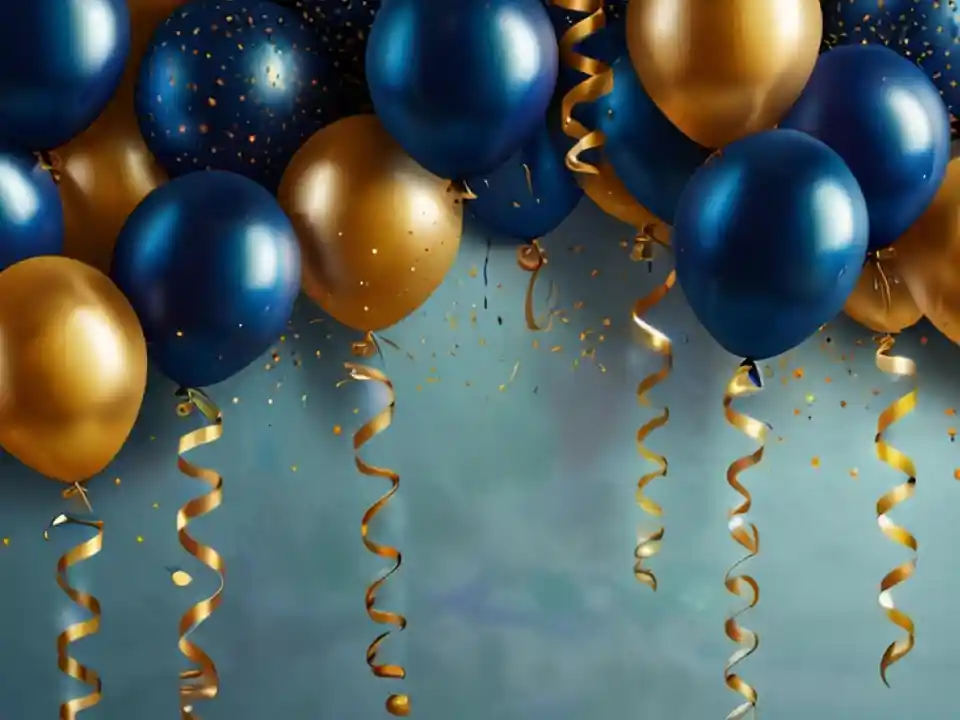
12. Navy Blue & Gold – Strong and Refined
A more serious, premium version of blue themes.
Styling tip: Keep gold minimal so it doesn’t overpower the setup.
13. Teal & Silver – Unique but Safe
Not as common, which makes it stand out more.
Styling tip: Works great if you want something different without taking risks.
14. Baby Pink & Lilac – Soft and Trendy
A gentle colour palette that feels modern and visually pleasing.
Styling tip: Add white balloons to keep everything balanced.
15. Black, White & Silver – Sleek and Modern
Minimalist but very effective.
Styling tip: Focus on clean arrangement and spacing for best results.
16. Yellow & White – Bright and Clean
Simple, cheerful, and easy to work with.
Styling tip: Use different balloon sizes to avoid a flat look.
17. Burgundy & Gold – Deep and Elegant
A richer alternative to red that feels more mature.
Styling tip: Best suited for evening setups or premium styling.
18. Blue & Yellow – Bold Contrast
This combination stands out immediately.
Styling tip: Keep proportions balanced to avoid overwhelming visuals.
19. Pink, White & Silver – Soft with Shine
A nice balance between gentle tones and a polished finish.
Styling tip: Add chrome silver balloons for that extra shine.
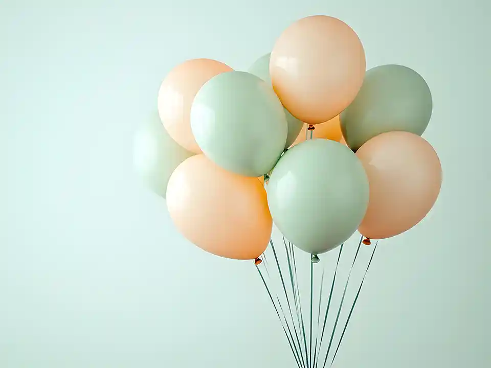
20. Mint Green & Peach – Fresh and Modern
Light, refreshing, and slightly unique without being risky.
Styling tip: Great for creating a relaxed, welcoming atmosphere.
21. Gold, White & Transparent – Clean Luxury
Simple, but very effective.
Styling tip: Clear balloons with gold confetti instantly upgrade the look.
How to Choose the Right Balloon Colours (Without Overthinking It)
If you’re stuck, use this quick guide:
- Want premium and safe? → White + Gold / Black + Gold
- Want fun and energetic? → Bright colours / Rainbow
- Want modern and trendy? → Nude / Pastel tones
- Doing corporate events? → Brand colours + white or silver
The key is consistency — once you choose a palette, stick to it.
Common Balloon Colour Mistakes to Avoid
This is where most setups go wrong:
❌ Using too many colours (looks messy)
❌ Mixing too many finishes (matte + chrome + transparent randomly)
❌ Ignoring lighting (dark colours in dark venues = dull look)
❌ No clear theme or direction
Keep it simple, and your setup will already look better than most.
Conclusion
You don’t need complicated designs to make your event look good.
You just need the right colour combination — and to execute it consistently.
Start with any of these 21 combinations, and you’ll already be ahead of most setups. Clean, balanced, and visually strong — that’s what people remember.
Frequently Asked Questions
1. What balloon colour combinations look the most premium?
White & gold, black & gold, and navy & gold are the most premium-looking combinations.
2. How many colours should I use for balloon decorations?
2 to 3 colours is ideal. More than that can make the setup look cluttered.
3. Are pastel balloons better than bright colours?
Pastels feel softer and more premium, while bright colours feel more energetic. It depends on your event style.
4. Can I match balloon colours to my brand?
Yes, especially for corporate events. It helps create a more cohesive and professional look.
5. What colours look best in photos?
White, pastel tones, and balanced colour combinations usually photograph best.
6. How do I make my balloon setup look more expensive?
Use fewer colours, add metallic accents, and mix balloon sizes for depth and layering.